icographic 07
1974 Icographic
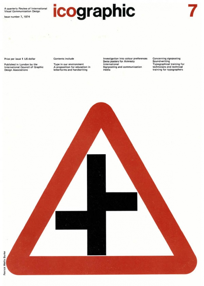
TABLE OF CONTENTS
1 Introduction
2 Type in our environment Armin Hofmann
This short article is taken from the introductory remarks to an illustrated Tecture given by Armin Hofmann at the 16th International Congress on 'Education in Letterforms' held in Copenhagen. The Congress was organised by the Association Typographique Internationale, and we are grateful to them for their permission to publish this extract.
3 A proposition for education in letterforms and handwriting Wim Crouwel
The text of Wim Crouwel's article is taken from a paper given at the 16th International Congress on 'Education in Letterforms', held in Copenhagen during August 1973. The Congress was organised by the Association Typographique Internationale, and we are grateful for their permission to publish it in this issue.
4 Investigation into colour preferences Tom Porter
6 Swiss posters for Amnesty International
In July 1973, the Association of Swiss Graphic Designers (Association Suisse des Graphistes ASG) sent a letter to all its members, associates and students, asking them to take part in a poster design project for Amnesty International. The subject chosen was: "How the graphic designer sees the problem of the torture of political prisoners…". A jury representing the ASG and Amnesty International has chosen one of the submitted designs for use as an official poster. The posters were exhibited recently. None was given pride of place nor was any order of merit indicated. The sole aim of the exhibition was to show the many differing interpretations of the theme. It showed also the deep concern of Swiss graphic designers over the use of torture. Shown here are 30 of the 75 posters which were exhibited. The numbers are intended only as a means of identifying the designers. They do not indicate any order of merit..
8 Sound-writing Kingsley Read
George Bernard Shaw died convinced that a new English alphabet was needed to enable people to write and read the language more efficiently. He left funds for that purpose, and the evolution of the new alphabet, known as the 'Shaw Alphabet', is related here by its designer Kingsley Read.
12 Concerning Signposting Paul Mijksenaar and Gerard Unger
Paul Mijksenaar originally trained as an industrial designer. Since then he has worked in both industrial design and graphic design. He is Chairman of the Applied Art section of the Arts Council of Amsterdam. He is also a member of the Dutch Commission NEC 3C (signs for apparatus) and of ISO/TC 145 which is concerned with the international standardization of graphic symbols. Gerard Unger trained as a graphic designer. Following work for a number of organizations he set up a free-lance practice in 1970. In collaboration with Joh. Enschede and Sons he designed the typeface 'Markeur' for engraving on plastics and metal plates, together with a signing system. In 1972 Paul Mijksenaar and Gerard Unger went into partnership, forming a design consultancy called Sign Design specialising in the problems of signing and situated in Amsterdam.
15 Signposting and Communication Media Paul Mijksenaar and Gerard Unger
22 Typographical training for technicians and technical training for typographers Adrian Frutiger
The text of Adrian Frutiger's article is taken from a paper given at the 16th International Congress on 'Education in Letterforms', held in Copenhagen during August 1973. The Congress was organised by the Association Typographique Internationale, and we are grateful for their permission to publish it in this issue.
23 Note to Contributors
24 Appendix to sound-writing