icographic 08
1974 Icographic
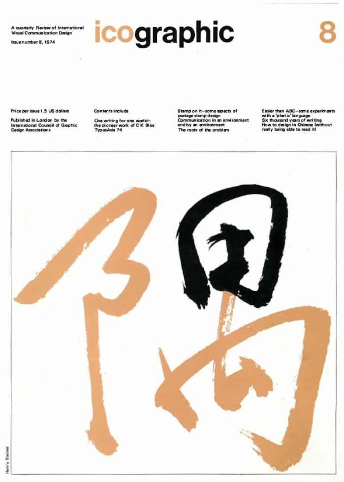
TABLE OF CONTENTS
1 Introduction
3 One writing for one world—the pioneer work of C K Bliss Patrick Wallis Burke
Experiments conducted by teachers have shown that children grasp these pictorial Blissymbols quicker than words. They can read new combinations they have never seen before, and they can boldly and logically combine new meanings they need when writing to penfriends who speak other languages.
7 TypoAsia 74 Sato Keinosuke
The majority of participating countries use Indian type letters. Syllables are formed by adding vowel signs over, under, or on both sides of the consonant. If typefaces are constructed with the vowel signs integral with the character, the number of pieces becomes extremely large. Consequently, the vowel signs are cast separately from the consonants, as additional characters. There are a great many, and they are very small, so that it takes a lot of time to set type. They are also easy to damage or lose. For syllables that are used very frequently, the vowel signs are made integral with the character. As a result, there is a real need for studies of frequency of syllables to be undertaken.
8 'Stamp on it'—some aspects of postage stamp design Stuart Rose
The author, who is Design Advisor to the British Post Office, gives a short historical survey of British postage stamp design, from the first ever stamp (the Penny Black of 1840), to the present day. He then goes on to discuss the various difficulties that accompany the design of the many commemorative issues that are now produced in Britain.
12 Easier than ABC-some experiments with a 'plastic' language Peter Watson
Today Charlie W is a star pupil. A year ago he was a mental write-off to many people. He had an IQ of only 15 then (the average is 100), and the chances of him ever being able to look after himself or do any of the ordinary things which children enjoy seemed completely beyond him.
13 Communication in an environment and by an environment Peter Kneebone
When we speak of corporate identity we are probably thinking of systems of products, services, events, and so on, and the way in which they are identified and communicate coherently with us, either as users or as potential users. A corporate identity, in this sense, is something which is designed (perhaps for the first time, or perhaps revised and recreated more than once) to identify, coordinate and express the special character of the system in all its manifestations-both to its consumers and to those who operate it. To make me feel good about buying it, or feel good about working for it. To make me recognise it instantly. To make me want it. To tell me how to use it. To rationalise its functioning. Also to make it more profitable.
15 The roots of the problem Hartford Thomas
If you are looking for moral stories about the way we live now you can hardly do better than consider the present state of the paper industry.
16 Note to contributors
16 Six thousand years of writing René Ponot
The general public is surprised and impressed to learn that many people wrote "in the past" on a wide variety of materials. Doesn't this happen nowadays and in many extraordinary ways? The man in the street can have few preconceived ideas about it. Does the mother who dishes out a ladle-full of soup containing dozens of letters of the alphabet, ask herself whether the pasta is a material for writing?
23 How to design in Chinese (without really being able to read it) Henry Steiner
The designs shown in this article were done by me during the past few years, employing Chinese characters.