2ND BIENNIAL OF LATIN LETTERS OPENS IN VENEZUELA
13.06.2006 News
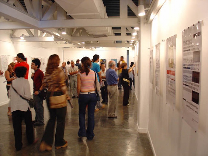
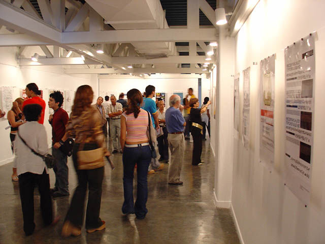
Caracas (Venezuela) - New forms of typographies of some Latin American
countries are shown in the 2nd Biennial of Latin Letters. The event is
taking place at the Carlos Cruz Diez Museum and is an exhibition of
different proposals that go from the vanguardist to nationalist
tendencies. Biennial judge to Venezuela, Juan Carlos Darias, explained.
Darias gave as example of the last tendency of the typography the Venezuelan designer John Moore who showed, among other proposals, letters with iconographic elements of the maquiritare ethnic group.
"Creating new alternatives tendencies to typographic level is important because we have been 500 years depending of fonts made outside of the country."
He reminded that, in most of the cases, traditional letter fonts like Times New Roman and Arial are used, however, none of them with a local name like Chuao or Petaquire.
New typographical proposals in the categories of text, title, iconographics, screen and experimental conform the exhibition which compile the 70 most remarkable works of the 427 contestants, besides all Venezuelan proposals.
The symbol of the Biennial is a big A with the height of the visitors and it has been exhibited in the hall of the museum. This A was created by the Argentinean Ruben Fontana who was the responsible for creating the Biennial.
Fontana, after founding the chairs of typography at the Buenos Aires University in the 80's, created the typography magazine. In 2001 organized an event called Typographic/Buenos Aires in which was carried out an exhibition of typographical proposals named Latin Letters.
Two years later he began to talk with colleagues of different countries, so the decided to create the Latin American Biennial 2004, in which participated Argentina, Brazil, Chile and Mexico as guest countries and organizers, according to Arias.
The experience happens again this year with the 2nd Latin American Biennial. The prize will be the recognition and the exhibition of the winner typographies in the 8 contestant countries, which are the ones of the latest edition plus Colombia, Peru, Uruguay and Venezuela.
"There is no doubt that this is the most important typographical event of Latin America and one of the most important of the world," Arias highlighted. He said that the proposals of the Biennial, all unprecedented, could be commercialized or disseminated from this event.
From the 427 proposals 32 were Venezuelans, he stated.
Six of those 32 got winners, and were made by design students like Johanny Franchi, and even by experienced professionals, such as John Moore.
One of the posters of the exhibition says that the form is the message. Darias agreed and exemplify that meaning with the case of the gothic letters.
"If we have a reference to the historic and cultural period of the gothic is through the gothic letters. That is the synthesis of artistic, cultural and social movements", he stated. He pointed out that typographic fonts are able to show information by themselves.
For further information please contact:
W: www.letraslatinas.com/bienal2006.shtml
relatedarticles

04.05.2021 News
in memoriam: essam abu awad (1958-2021)

10.16.2020 News
in memoriam: yu bingnan (1933–2020)

10.02.2020 News