Conceiving type in colour

09.06.2010 Features
Thomas L'Excellent
Bucking the rule that a typeface should be drawn in black and white, Thomas L'Excellent analyses what's behind designing alphabets in colours. A prerequisite in composition, colour is here shown to have structuring ability besides its role in decoration. © étapes
Colour and lettering are staples of our everyday life, yet it seems that these two worlds are keen to stay independent, never sharing their respective qualities. Is there really not a single application of colour that could enrich alphabet design?
Ask a type designer, and the reply is firm: to function, a letter must be drawn in black and white, for the strongest possible contrast with its substrate. Colour isn't even an issue. Only form matters, and with reason: a typeface must efface itself behind the message it conveys. But if this can understandably be applied to body fonts, one can also imagine a title indulging in more fantasy and, in particular, embracing colour. Colour has been ubiquitous in the history of mankind since the first huntergatherers, tens of thousands of years ago. The peoples of ancient times - the Greeks, Egyptians, Romans, Chinese, Aztecs - as well as today's artists, architects, photographers, fashion designers and graphic designers show a remarkable enthusiasm for coloured creations, but type designers have stayed on the sidelines. Only a few - who sometimes are more graphic designers than they are typographers - have ventured to create alphabets in several colours. Here are some examples.
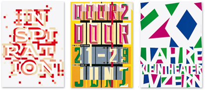
Above (L-R): Kris Sowersby, Klim Type Foundry, WFG; ?tienne Robial, Jules alphabet; Kris Sowersby, Klim Type Foundry, Wild Flour.
Decorative colour
Here, the decorative effect is pushed to the max. Most polychromatic typefaces are based on a similar principle: a relatively common face provides a basis, and is enriched by one or two layers of decoration. The effects are various, equally involving the inside of letters, through the addition of ornament; and the outside, with the use of outline and relief. The features are not needed to read the typefaces.Though essentially decorative, these colour additions are not all just mere tricks. Some roll back the limits of ornamental possibility and begin to explore the very structure of the letter, disrupting it and hinting at alphabets in which colour cannot be dissociated from lettering. One of the most remarkable creations to adopt this philosophy is History, the typeface by the Slovakian Peter Bilak. Twenty-one layers of ornaments, serifs, outlines and so on, can be mixed to offer a multitude of fonts (éi: 15).
Above: Alphabet Snuffféérie. Typeface developed by Alexis Wakey for artist Julia Tabakhova, using forms from the latter's work.
Geometrising colour
In parallel to these decorative alphabets, some fonts incorporate colour as a structural element, thus authorising it to co-exist as a letter-building principle, in the same capacity as form. Because these creations explore the anatomy of each letter to better dissect it, they offer us an in-depth analysis of their architecture. Which is maybe why many alphabets that use colour at their core are directly based on a strict, mathematical principle of construction.Geometric grids, matrices, modules and forms all offer possibilities for standardised assemblies that will help these alphabet designers to incorporate colour more easily. Letter shapes are reduced to their main characteristics, with colour thus given a decisive role.
Yet these designs - though highly interesting - are too consistent, overlooking the human aspect of writing and tending towards abstractions that sacrifice legibility to plasticity.
Above: Typeface by Atelier ter Bekke/Behage.
Above: Sonia by Pierre di Sciullo.
Structural colour
Whether two- or three-colour, these alphabets illustrate some of the benefits of chromatic type: it attracts amazement with its unconventional look; it reveals itself by explaining its construction; it becomes lighter by proposing less complex forms; and it plays with depth by bringing some of its parts closer and distancing others. Many possibilities have yet to be discovered.Whereas the alphabets presented in the above paragraph forego a degree of formality to give colour greater room for expression, that is not the case here. The highly graphic appearance of the letters is abandoned here in favour of more traditional character design. The outlines are more reasonable, and closer to those bequeathed by thousands of years of handwriting evolution. Filled with even colour, they could even melt into everyday typographic output.
Yet their designers did not want to create monochrome type (or even achromatic type, in view of traditional alphabets' indifference to colour), but clearly opted to disassemble the letters into different coloured parts. The cutouts and overlays/ overprints allowed by the interaction of several colours have been carefully studied, and employ the distinctive features of each letter.
Above: Hudson-Powell, Responsive alphabet.
Benjamin Gomez, Fraktur Volumen. Triplecolouring gothic type helps to suggest various surfaces. In three dimensions, the type's elegance is volumised. Adding colour also makes the face less austere.
State of Affairs
As we have seen, colour is no longer only something that a graphic designer adds to a work previously conceived by a type designer. On the contrary, the relevance of using multiple colours in a typeface is maximised, because they enter the creative process at an early stage.Opening up the type world to colour is the consequence of technological evolutions that have radically altered trades involved in the graphic-design production chain. On the one hand, multicolour printing has become a common option and its cost has fallen considerably; on the other hand, IT tools, which are now accessible to any visual designer (amateurs and professionals), have become established by greatly simplifying creative activity and the practise of the graphic arts.
However, the introduction of colour into script is being impeded by the same factors that ease its access. Firstly, type designers essentially seem attached to reclaiming the typographic excellence that reigned in the age of lead. Quality has indeed deteriorated with the many milestone inventions of recent centuries (Linotype, Monotype, phototypesetting and, of course, the computer); at the very least it can be said that the opening up of type design to beginners, while yielding new fields of experimentation, has often affected the quality of the art.
Above: Studio Moiré, Balkan Karavan, type created for the festival of the same name.
Above: Hell. © Change Is Good with Alexander Meyer.
Secondly, software programs are so complex to write that they have been left in the hands of programmers, who constrain - unwittingly, it's sad to say - graphic and typographic design. Visual designers seldom find time to develop their own applications. The rollout of digital type has been largely based on the capability offered by lead, that is, a fixed and definitive form, and by monochrome printing. The rare attempts at modernisation have never been backed by the big software publishers, and are now totally forgotten.
OpenType (the leading format for typeface distribution) only supports PostScript Level 2 encoding, even though since 1984 Adobe has made it possible to distribute alphabets in PostScript Level 3, which can actually handle shading, colour, gradations, transparency, patterns, images, lines of variable thickness, etc. within letters. In 2003, SVG [1] (an XML-based open-file format) defined the possibility of creating equally potent typefaces, and yet no software to date can read them. At a time when all new type is designed digitally, programs and their distributors wield considerable influence. Only a reality check by all stakeholders will help type design and experimentation to evolve.
Above: Cyril Cohen, Sens. This face was developed as an offshoot of CohenÂ’s work to design the Cnap family of alphabets. Its visual principle (solid letters) was borrowed from the Frutiger concept, which compares the outline of the letters, once the counterforms are filled, to a keyhole.
References
- SVG is a language standard recommended by the World Wide Web Consortium (W3C). This non-profit body only advises on the standardisation of Internet technologies; it does not develop software programs.
This article derives from Thomas L'Excellent's fourth-year dissertation at the École Nationale Supérieure des Arts Décoratifs, Paris. The full version (in French) can be read here: http://typo.thomaslexcellent.com
This article was published in , issue 19, spring 2010, and has been republished with permission. © étapes www.etapes.com/international
relatedarticles

03.14.2022 Features
goodbye! and next steps for colleague and friend alexey lazarev
05.27.2020 Features
explorations in ethical design: meditations on equality

05.16.2017 Features
RCA launches new programme: MA Digital Direction
12.14.2016 Features
Interview | Ermolaev Bureau (Moscow)

05.11.2016 Features