PUTTING ACROSS LANGUAGE IN TYPE - NEW DICTIONARY DESIGN
05.08.2009 Features
Herbert Lechner
The dictionary as a typographical challenge. Market leader
Langenscheidt has boldly embraced a complete restyle of the lexicon
page. For Kochan & Partner's professional designers and typeface
designer Ingo Preuß this was a labour-intensive and an exciting
challenge. Originally published in , this article takes a look at the process and final result.
The effects of globalisation can probably be most directly felt in the dictionaries market. Worldwide communication demands that we understand one another across linguistic frontiers, and the media revolution has not stopped at the dictionary. Remarkable diversification has been going on for a long time. The range extends from fat, sometimes multi-volume reference works with extensive etymological and orthographic information down to handy phrasebooks for holiday and business travellers, as well as concise pocket editions and mini versions - not to mention special editions for specific professions or occasions ('German-Woman/Woman - German').
Despite the vast array of competing electronic options, the book seems unbeatable as a medium in this sphere. It is true that reading habits and uses have changed. This means that not only is continuous updating of the contents necessary. Modifications and careful modernisation have always been a part of definition design but now Langenscheidt, long the very embodiment of the dictionary, has finally taken a step towards thoroughgoing redesign. If former innovations were initially internal and geared rather towards changing contemporary tastes, a special agency was now for the first time commissioned with the task, the true scale of which only gradually became clear.
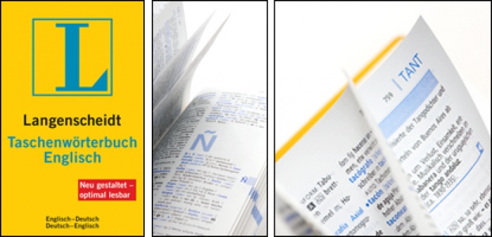
Above: Original design
Above: Redesign
For Martin Summ, head of typographic development and production at the agency responsible, at any rate, tackling the field of dictionaries proved an expanding labyrinth full of snares and pitfalls. French, for instance, brought him almost to despair because typographical presentation is completely different here. But even the publishing professionals had to be made aware of just how much attention to fine detail was needed. A joint workshop was held at the beginning of the enterprise to hone problem awareness. One particular aspect of the task lay in choosing a particular typeface as the requirements here reach far beyond aesthetic effect. It isn't just that the selected types have to encompass countless diacritical marks, the phonetic alphabet and various special characters in order to embrace every language. No less important is the question as to how broad a typeface should be without appearing too small or narrow - in the face of the typically large quantity of material, this can significantly affect the size of the finished work.
We should not underestimate the significance of one further point. The objective was to use one type family for all elements. An ambitious innovation as even the commonplace two-type solution often presents the designer with problems, in view of the vast quantity of different display and emphasis devices necessary within a single definition. It is not only of paramount importance that a typeface is easily legible, it should also facilitate finding. Martin Summ encapsulates the problem: "The purpose of a dictionary isn't to be read, but to allow people to find." Search criteria are however highly varied. While some users will be content with a simple translation, some will want to know the correct pronunciation, and others might want specialist definitions and the most recent colloquial turns of phrase or syntactical peculiarities. Moreover, as all users are generally in a hurry and expect an immediate answer to their query, the system of organisation itself has to be self-explanatory. Long explanations or instructions for use are not called for. Given these requirements only a few typefaces were possibilities, but a lucky choice was eventually made: Phoenica, designed by young Type designer Ingo Preuß, not only provided a complete typeface family that left out no foreign character set or special symbol. The designer was also immediately willing to provide new extra characters where needed. As the small but perfectly-formed type label GTF (German Type Foundry) had an office in Munich with Michael Bundscherer, communication was easy and quick. Perfectionist Preuß created what was needed on a 'just-in-time' basis, so there were no delays. This would have been unthinkable if a typeface from one of the major suppliers had been selected. The finished typeface is not an exclusive design, but it is Langenscheidt´s very own, tailored to the special needs of dictionary design, created on demand.
And the result? Even the lay person is immediately struck by the difference from traditional dictionary design. The pages are clearly organised without particular passages coming to the fore. The customary uneasy juxtaposition of two typeface families has been eliminated. The whole has a fresh, modern, coherent appearance, offering at the same time a clear system of order. Many subtle refinements facilitate well-targeted searching and at-a-glance consultation. The structural logic within an individual word entry is highly accessible, without being a distraction from the actual definition. Even where a great many definitions are assembled under one headword or different syntactical associations have to be referred to, the new system works very well - a masterwork in compressed form. Compactness is, after all, a prerequisite, even in the largest dictionaries.
One might be justified in claiming that such a feat of typography is a contribution to international understanding!
This article was originally published in novum 07/09 and has been republished with permission.

relatedarticles
03.14.2022 Features
goodbye! and next steps for colleague and friend alexey lazarev
05.27.2020 Features
explorations in ethical design: meditations on equality
05.16.2017 Features
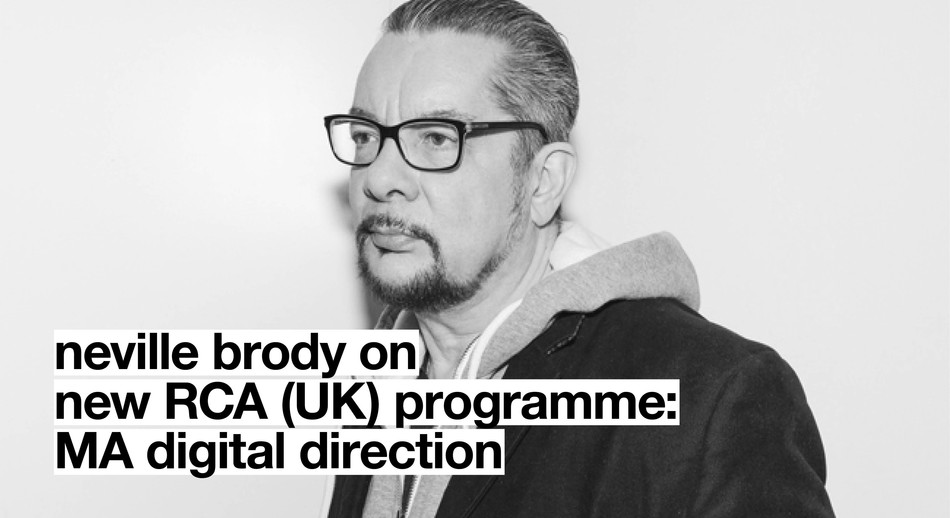
RCA launches new programme: MA Digital Direction
12.14.2016 Features
Interview | Ermolaev Bureau (Moscow)
05.11.2016 Features