Summer Olympics 2016: Rio's brand sculpture gets the thumbs-up

28.07.2011 Features
Jennie Fourie discovers the development process for the Rio Summer Olympics 2016 brand identity. She compares the positive reception of Rio's official identity to previous Olympic events and explores what makes the brand so successful. Fred Gelli, T?til partner and creative director, will be a panellist at the Urbanism Keynote at the 2011 IDA Congress in Taipei, Taiwan (Chinese Taipei).
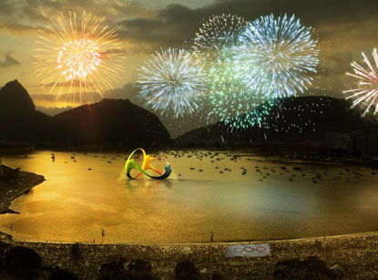
Rio de Janeiro's Copacabana beach was abuzz on New Year's Eve when a million people saw the launch of Rio Summer Olympics 2016's brand identity. Developed by the agency T?til, a Brazilian company specialising in strategic consultancy, brand building and management, the brand Rio 2016 breaks new ground with its sculptural form. The brand mixes volume and form, light and shade. It has a front and a back, and can be viewed from multiple angles.
Above: The Brazilian environment and the character of it's people inspired the colour choices for the Summer Olympics 2016 logo. "Yellow symbolises the sun and our warm, vivacious and happy nature. Blue expresses the fluidity of the water that surrounds us, and our easygoing way of life. Green represents our forests and hope, a positive vision that inspires us to go even further," explains T?til's creative team.
According to Beth Lula, manager of the Branding Department of Rio 2016 Organising Committee, T?til entered the process of designing the logo along with 138 other competitors. By the end of several qualification stages, the proposals submitted by the eight remaining agencies were evaluated by a multidisciplinary evaluation commission, composed of 12 professionals enjoying both national and international market recognition for their experience in brand design and approval. The team finally made their decision in T?til's favour.
The logo was the result of a co-creative and collaborative process that lasted almost two months generating more than 50 options up for consideration and producing hundreds of renderings. The design process brought together multidisciplinary teams from the agency's offices in Rio and S?o Paulo. The brand Rio 2016, the designers believe, epitomises the Olympic spirit and its athletes, as well as the nature, feelings and aspirations of Rio de Janeiro and Brazil. T?til says that the logo is based on four concepts of contagious energy, harmonious diversity, exuberant nature, and the Olympic spirit.
Supporters raved at this colourful, multidimensional masterpiece, while hard line critics immediately started scanning for a scandal. Critics soon found something to hook onto - alleged copying. However, this was soon rejected by the creators of the Rio identity who proved that similarities with the logo of the Telluride Foundation in Colorado were vaguely coincidental. Fred Gelli, T?til's partner and creative director told the GloboEsporte.com that the agency did extensive research to guarantee the design was unique. "For some reason, we missed that one," Gelli said, when he acknowledged the similarity with the foundation logo. "The brand is radically different because it is tri-dimensional," Gelli said. On the other hand, could the foundation's logo also have elements of the logo of the Rio Carnival of 2004 (the similarities are glaring and an obvious copy of the Rio Carnival logo) and what similarities were there to be found with Henri Matisse's painting, The Dance that was painted in 1910? The plagiarism claims, in this instance, were somewhat of a long shot.
Controversy's the name of the game
Above: The redesigned London 2012 Summer Olympics logo attracted much criticism from the design community, the citizens of London and other quarters. Courtesy IOC/Olympic Museum Collections.
Olympic branding programmes are notoriously prone to controversy. Since the inception of the modern Olympic Games at the turn of the previous century there has not only been fierce competition on the sports fields and in the water, but life-and-death contests have also been fought about who would be hosting the event that is presented every four years. But the battle doesn't stop once a host city has been appointed. Then follows the race of who would get the prize contract of designing the host city's logo or emblem.
Cities invest massive resources to host these prestigious events and they call upon their most talented designers to come up with an emblem that would not only embody what the games are all about, but also what the host city wants to show the world when it comes to its geography, it philosophy and its essence.
Barring the mutters of copying when the Rio logo was unveiled, the general verdict has been positive. In a newspaper poll conducted in Brazil more that 70% of respondents liked the logo. This figure is in stark contrast with the 80% of respondents who gave the London 2012 Olympic Games logo the thumbs-down in a BBC poll conducted in 2007. Respondents did not rate this controversial logo as gold, silver or bronze, but just about across the board gave it a wooden spoon. Comments buzzing over the Internet described the problematic emblem as a smash. Someone commented that it looked as if the logo had been dropped on the floor and it broke. And as if this wasn't enough, a segment of the animated footage promoting the 2012 London Games had to be removed from the organisers' website, as it could apparently cause epileptic fits.
Above: Both Sydney 2000 and Vancouver 2010 logos attracted controversy due to 'appropriation' of symbols originating from ancient indigenous cultures. Courtesy IOC/Olympic Museum Collections.
Other recent controversial sports logos have included the logo of the Vancouver Winter Olympics 2010. The logo depicts an inukshuk, a symbol used by the Inuit people of Canada's arctic regions. For centuries the Inuit have stacked rocks, sometimes into human forms, to create guideposts for travellers. The designers saw the logo as an "eternal expression of the hospitality of a nation that warmly welcomes the people of the world with open arms every day." But some people felt that the symbol did not reflect the native art and culture of the Vancouver region and the rest of British Columbia, such as totem poles. One comment from an Inuit elder summed it up when he asked whether the logo depicted Pac Man or Frankenstein.
Other controversial logos include that of the Sydney 2000 Summer Olympics, mainly because of a complicated and drawn-out process calling for submissions. The logo included a boomerang to depict aboriginal culture, but many critics thought this inclusion to be forced.
The fact remains - it's a highly complex process to design a sports emblem or logo. Not only does the design team have to depict the spirit of the event and the location, they also have to take cognisance of the subtexts involved and how the logo would be received internally, as well as by a broader audience that, in many cases, include most of the nations of the world.
In recent years, Athens 2004 and Beijing 2008 seem to have done it right, with the design teams behind the branding programmes receiving more acclaim for a job well done than criticism. Even the harshest critics could find little fault with these, which were beautifully executed in their rollout.
But back to Rio
Above: An early series of sketches inspired by Sugar Loaf mountain. Courtesy of T?til.
Advertising specialist, Washington Olivetto describes the Rio 2016 brand as having "graphic harmony and continuous movement needed in the practice of all sports". It can be still or in 3D, with angles suggesting infinity. Designer Ricardo Leite also waxed lyrical about the logo which he describes as "a sculpture or jewellery that gains new angles as it turns".
A logo of an international sporting event should reflect the country in which the event will be held. One of the premier design elements that can be used to this end is colour. Previous logos that used colour (or the lack of it) to great effect have been the starkly beautiful black-and-white op-arty logo of the Summer Olympics 1968, hosted by Mexico and vivid blue of the Athens Olympics 2004 that brings to mind the Aegean Sea in all its sparkling splendour. Barcelona's logo for the Summer Olympics 1992, on the other hand, used a vivid palette of red, orange and blue resonating with the rings of the Olympics emblem.
In the case of the Rio logo colour is an embedded theme. The theme is carried out by three human figures in green, blue and orange (again reflecting the Olympics' rings) holding hands and in a dancing mode. The shape of the logo is formed by the space between the dancing figures and resembles one of Rio's most magnificent landmarks, Sugarloaf Mountain.
Above: Three-dimensional rendering of the final brand identity. Courtesy of T?til. See more of the development process in the original article.
The vertical shape between green and orange and the horizontal shape between green, orange and blue, both make up the shape of the Sugarloaf. This landmark comes to life and gains a three-dimensional perspective, with volume and cut-outs. Contours create the topography of the city in our imagination. A brand-sculpture, infinite, that gains textures and shapes, transforming it into an object.
As one commentator said: "The final logo of the Summer Olympics 2016 is in complete affirmation with the culture and colours of Rio de Janeiro, the host city and the spirit of Olympics Games."
We can go with that. All that remains is to see how the brand will be rolled out. If the success of the logo is anything to go by, this will indeed be a celebration of what can be achieved by design.
In conversation with the T?til design team
What was the initial brief and how did their original interpretation change as the project developed?
"The Olympic Games Committee's original brand evaluation briefing included the following:
- To reflect the local culture having a universal understanding, in line with Olympic values;
- To avoid local stereotypes;
- To be innovative and to inspire and thrill a diversified public;
- To transform the city and the country's image in synergy with the transformation moment of the Olympic movement."
How did this project differ from other branding projects that that the company had developed in the past?
"The method was the same used in others brand creations. We used our tool 'BranDirection' to create the four inspiration pillars: Olympic spirit, harmonious diversity, exuberant nature and contagious energy. The difference is that the brand was born from a co-creative process of collaboration that lasted almost two months. Our staff immersed themselves in the Olympic world, in the relation of Brazil and Rio de Janeiro and the Olympic spirit, working together on the two main themes: transformation and passion."
What were some of the challenges and the solutions the design team faced?
"We followed and accomplished all the procedures and strict requirements set by the Rio 2016 Organising Committee. Internally we took serious precautions to insure the brand remained unpublished and unique until its official launch. We were very happy and proud of the final results, especially because the brand was approved by members of the judging committee and its members from IOC, BOC, federal, state and local government, marketing consultants that worked in the Beijing and Athens Olympic Games, and design agencies' representatives."
Re-published with permission from DESIGN>MAGAZINE. See the original article.
About the author
Jennie Fourie has roamed the South African media landscape for the past 25+ years. At present she is a freelance copywriter, journalist and media consultant with a special interest in innovation and design. Industrial journalism is a passion and she has been co-organiser of the corporate publication competition of the SA Publication Forum for the past ten years. She has been a judge in a variety of publication competitions, both locally and abroad. Jennie holds a Masters degree in Journalism.
relatedarticles
goodbye! and next steps for colleague and friend alexey lazarev
explorations in ethical design: meditations on equality
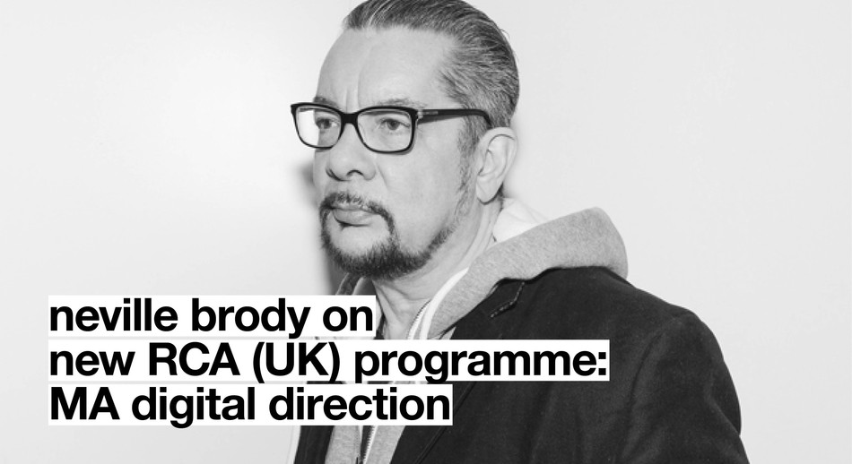
RCA launches new programme: MA Digital Direction
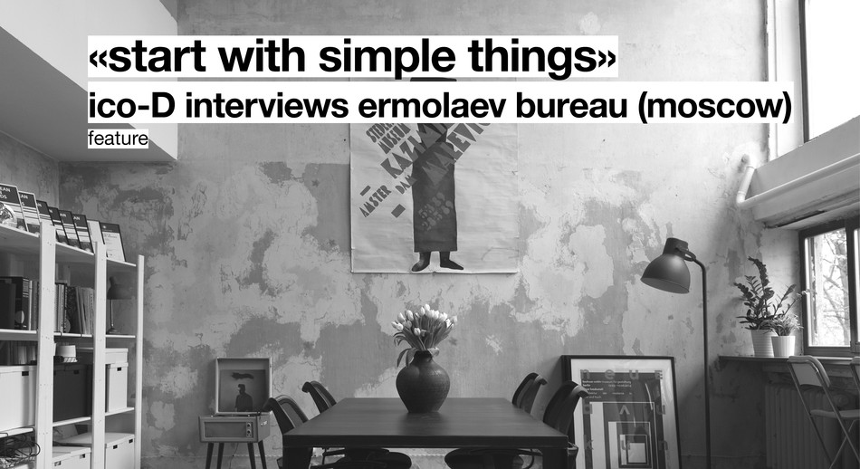
Interview | Ermolaev Bureau (Moscow)