Typographic categories: Yes, there is life beyond letters, but... what does it all mean?
06.01.2012 Features
V?ctor Garc?a (Argentina) seeks a positive definition for type families composed of pictograms, symbols and other elements beyond language representation. He explores current terms, which fail to represent the whole category and proposes more descriptive terms.
The use and conventions of the typographic trade have allowed us to determine a short, relatively effective classification nomenclature with five standard categories to organise type specimens and type contests. The categories Text, Display, Screen, and Experimental are clearly established and understood by all. Thus we hardly find any incongruities or vagueness in the represented subjects and their application as technical categories based on use and functional features. However, there is a particular category that appears to have no consistent definition and offers some substantial differences based on the language and the particular criteria of the professionals involved, their time and their cultural background.
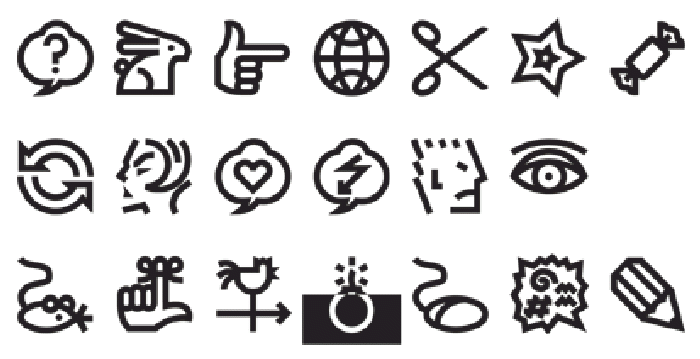
Curiously, this is a category which, far from stagnating, seems to have achieved significant growth since the arrival and universalisation of computer-aided design a few decades ago. It comprises all but the alphabet letters in its conventional morphology. This exception is necessarily made as, within the spectre of these fonts, some are alternative systems to alphabetic reading (deaf mute sign language, nautical systems, etc.) - it would be impossible to contend that these do not belong to the alphabetical universe, even though they lack the letters some people could be willing to recognise as such.
These typographic developments have many names in English, including dingbats, pi fonts, symbol fonts and, recently used by letter.2, non-alphabetics.
Above: GarciaToons type family with three styles: Bunny, Cat and Mouse. V?ctor Garc?a, 2008.
Dingbats is an informal term added to the academic lexicon by typographic art gurus, as is the case of well-known typographer and poet Robert Bringhurst. Dingbats is also a broadly popular word in graphic circles, frequently used even in Spanish, and possibly the most clear, precise, versatile and undisputed of all terms. Although it does not connote a pattern of usage, a function, or even a medium as the other assigned categories do, it still has the powerful virtue of associating the thing it designates without interference. There is, however, an indirect but significant inconvenience to formalize the term: in informal English, a 'dingbat' is a stupid or crazy person.
Pi fonts are a somewhat cryptic designation that suggests scientific use. Bringhurst refers to these fonts as belonging to a ghetto,2 so it would be recommendable not to rescue them from that place. In any case, we could keep it as a specific category for fonts of diacritics, mathematical symbols, figures, etc.
Symbol fonts is a consistent and widely-used denomination but, although it has seemed to be clear, stable and consolidated, the non-alphabetics from letter.2 came to inexorably alter this situation. Furthermore, it is far from a precise definition.
Non-alphabetics may be derived from 'no alfabéticas,' a definition sometimes used in Latin-American typography circles. If this were the case, it would be a loan word from the periphery. This would be good if it were to contribute real substance to justify or, better still, to enrich the typographic nomenclature. On the contrary, used as an all-encompassing tag of what-it-is-not offers the same inconsistencies in both languages for the imprecision of what it defines precisely because of its paradoxical vagueness.
Above: Tangomaniacs type designs. V?ctor Garc?a, 2002.
The Not-being and the No-places are usually attractive because of their witty extravagance, which consists in inverting the ontological value of non-existent attributes of the subject. This is something like a definition by absence, not by essence and it could be interesting as a philosophical exercise or a marketing tip. However, it is certainly vague and confusing when it comes to defining concrete features or effectively identifying its contents.
No, no, no! I've told you not! Are you a non-listener?
Let's try a negative classification exercise with other categories, e.g., humans:
- No-man = Woman
- No-young = Old man/woman
- No-silly = Intelligent
Let's imagine familial relationships:
- No-brother = Husband
- No-son = Dad
- No-cousin = Brother/Sister
We could also redefine professional affairs:
- Non-iconics = Alphabets
- No-text = Image
- No-CMYK = Black and white
This is a demonstration through 'reductio ad absurdum' of the inconsistency of the negative mode to clearly designate what we need to define. Conceptually, there is a common denominator not only in the above exercises, but also in whatever we can invent: hierarchy - the relative importance degree - is given by what is denied 'ad aeternum,' not by the intrinsic values we could verify positively.
Above: MotionBats type family Cat and Jump shown; three styles each: Regular, Bold and Black. V?ctor Garc?a, 2009.
In other words, when emphasis is placed on what is lacking, it is precisely the void that is left which inherently becomes the central value, the benchmark to measure the distance between the significance available and the very significant that will never be available, whether it is alphabets, persons, relationships or whatever one may want to express. And this subordination of the undefined subject to the other one - unattainable, but clear and concrete - is another reason to distrust the convenience of the negative in definitions.
Mostly this situation relates to some prejudices and to the lack of understanding of the phenomenon among letter specialists. Those for whom the natural order of things emanates exclusively from letters, can do nothing but analyse the whole facts and circumstances from this central value, their Golden Rule to explain the world. However, they may fail to remember in this process that the things we now call letters were represented objects in the past: A used to be an ox head; B, the house of God; C, the camel, and so on. Paradoxical as it might seem, we now face that the alphabet itself arose as non-alphabetic.
The history of typographic ornaments dates back to the very beginning of typography - fleurons and hederas abound in the most refined Renaissance printer's incunabula like Aldus Manuzio, Erhard Ratdolt and others4 - and this singular art became fully grown and flourished through the centuries, keeping pace with technological progress. Such creative energy seemed to have fired the reaction and, to a certain extent, the scorn from the typographic establishment, the zealous custody of the Holy Grail of Letters. An exaggeration? Read the following definition:
Dingbat A typographic character subject to scorn because it has no apparent relation to the alphabetÂ…
This was written by a talented type intellectual about twenty years ago, surely expressing his own zeitgeist, after the planetary flooding of dingbats (and, to be relevant, of bad alphabets) of questionable quality that were supplied by the massive influx of computers, once the exclusive territory of a few players. We don't know if Mr. Bringhurst - as this is his quotation - has ever changed his mind after great masters such as Adrian Frutiger and Hermann Zapf dealt with this issue. Frutiger designed Frutiger Symbols and Zapf designed both: the absolutely coherent and exquisite dingbats for his Zapfino, and the Zapf Essentials, a great qualitative advance over his previous and eclectic 70s Zapf Dingbats. Not to mention many lesser-known designers around the world who made remarkable dingbat fonts in the best tradition of typographic art.
Above: Ole Flamenco—Ole Torero type designs. V?ctor Garc?a, 2004.
No is no! Isn't it?
In an attempt to compare all the categories, let's do a last negative-definition exercise, this time reconsidering the consolidated type categories:
- No-display = Text
- No-text = Display
- No-paper = Screen
- Non-usual = Experimental
- Non-alphabetics = ?
This would be the most reasonable party when keeping the emphasis on the absence/lack of a feature.
Not to be or to be?
Before giving way to the typographic Not-being temptation, it would be convenient to ask ourselves a key question: Does this category lack positive features that might allow it to be defined for what it really is?
We could answer that ourselves. Just as alphabets are focused on letters, dingbat fonts are focused on images: a basic feature that implies they are illustrative, descriptive, symbolic, stylised, and synthetic; they embrace the whole spectrum of human activities being understandable, beyond the restrictions posed by language.
In conclusion there is a wide conceptual, instrumental, and functional basis that allows this category to be designated by its positive attributes.
Above: GarciaToons bunny - sample of use in combination with an alphabetic font. V?ctor Garc?a, 2008.
WellÂ… yes, of courseÂ… it might beÂ… Yes!!!
With such interesting antecedents available, it would be suitable to reconsider the category's definition, putting it in tune with the other affirmative categories.
Suggested terms: Pictographics, Pictographs, Iconographics, Iconics or simply Pictograms. Or even Pictotype, as a neologism based on its own properties might be.
The typographic unit or single type character might be properly called a pictogram, iconogram or pictotype.
With a nod of approval, the category would just start its migration from the diffuse Purgatory where it was confined to the typographic collective unconsciousness, developing its own identity on an equal footing with other categories in typography Heaven.
Footnotes
- Merriam-Webster dictionary, www.merriam-webster.com
- The Elements of Typographic Style. Robert Bringhurst.
Hartley & Marks publishers, Vancouver, 1992. ISBN 0-88179-033-8. p. 74. - The History, Evolution and Design of the Letters We Use Today. Allan Haley.
Thames and Hudson Ltd, London, 1995. ISBN 0-500-27835-0 - Alphabets and Ornaments. Ernst Lehner.
Dover Publications Inc, New York, 1968. Standard Book Number 486-21905-4 - The Elements of Typographic Style. p. 232.
First published in TYPO Magazine N? 45, Autumn 2011, Prague (Czech Republic).
About the author
V?ctor Garc?a (Argentina) is a graphic and type designer based in Buenos Aires. He loves imagining and exploring the creative capabilities of dingbats. He is an occasional contributor to design publications and has been a correspondent of the Munich magazine novum since 2002. His works have been published in Argentina, Japan, Germany, Great Britain, Spain, and the United States. His type designs include MotionBats (2009), GarciaToons (2008), Ole Flamenco-Ole Torero (2004), Bix Bats (2003), Tangomaniacs (2002), Bix Plain (2000) and Zootype (1997-1999). Ole Flamenco-Ole Torero won the tpG Prize at Letras Latinas, 2nd Latin American Type Biennial (2006), and Zootype Regular alphabet won 2nd Prize at the 2nd International Type Design Contest, Linotype Library (1997). His cover for Design Scene No 52, ',' was featured in the Galeria (2008).
Copyright Victor Garcia, Buenos Aires, Argentina. All rights reserved. victorgarcia.com.ar
No part of this article may be distributed or published without prior written permission of the copyright owner.
relatedarticles

goodbye! and next steps for colleague and friend alexey lazarev
explorations in ethical design: meditations on equality

RCA launches new programme: MA Digital Direction
Interview | Ermolaev Bureau (Moscow)