David Gibson: "Finding the Hidden Logic"

02.09.2009 Features
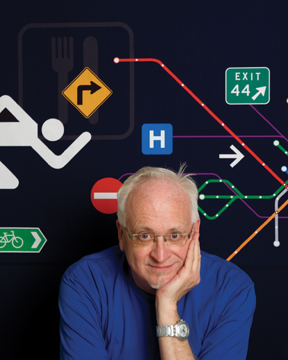
Two Twelve's co-founder, David Gibson, embraces a user-centered approach to helping people through complex environments. In an interview with Icograda Member organisation, the , David looks at his approach to wayfinding and design, based on his past education, experiences and interests.
2009 SEGD Fellow David Gibson, co-founder and managing principal of Two Twelve, is internationally respected for his thoughtful, user-centered approach to information design. In his new book, The Wayfinding Handbook: Information Design for Public Places, David shares his insights about finding the "hidden logic" in complex wayfinding situations.
An educator and advocate of the value of design for the public good, David has lectured at universities and design events worldwide. Within the past year he has been featured in The New York Times and Metropolis magazine, and well as on BusinessWeek's Innovation and Design Channel. He is a two-time past president and board member of and also served on AIGA's national board.
When did you first discover design?
I was 17 when Expo67 was held in my hometown of Montreal. It turned me on to this whole new world of creating special places using color, image, type, graphics, and media. I was dazzled by the work of people like Moshe Safdie, Buckminster Fuller, and Chermayeff and Geismar. I had a resident passport to this World's Fair and must have gone 50 times.
Montreal also opened a subway system that year. It was based on the Paris system with rubber tires and concrete rails, and was branded with this beautiful blue color. I can absolutely visualise those Montreal Metro maps. That was probably the root of my interest in designing public systems.
| Central Park Zoo (1987) "This signage and interpretive graphics program was acclaimed for its sophisticated design and clever approach to content. Large-scale panels of full-color, weather-resistant porcelain enamel or rear-lit transparencies, provide multi-layered background information about species and ecosystems. We intended to inform as well as entertain." |
|
| Atlanta Federal Center (1996) "Kohn Pedersen Fox invited us to design base building signage for the complex that consolidated several formerly scattered U.S. government facilities. To orient people to the complex, we created a simple wayfinding strategy and naming: AFC 1, AFC 2, and AFC 3. This was one of the first times I devised a strategy like that to provide a conceptual framework for a signage program. The two-dimensional T-graphic we created to render the name codes informed the 3D structure of the signage. ADA requirements inspired the Braille bar on the top of the sign." |
You studied architecture before switching to graphic design. How does that inform your work?
I studied architecture for two years at Cornell University before leaving to study graphic design, first at the Nova Scotia College of Art and Design and later at Yale University.
Starting out in the 3D world was actually a good thing. It helped me understand plans, space, and three-dimensionality, and the concept that inhabiting space is a sequential experience. Thinking in three dimensions is somewhat natural to me.
You've said you believe strongly in design for people. Where did your social perspective come from?
Between undergraduate and graduate school, I lived in Toronto and worked for the Ontario Ministry of Natural Resources, essentially the provincial park service. That was the dream job. I was a contract employee and would work for about nine months of the year doing park brochures, maps, and the like. We would start each work year traveling up north to visit the parks we'd be doing brochures for. Then I would go on furlough for the summer.
This was great because it gave me a lot of free time, and I became involved in the gay movement in Toronto. I volunteered on a very progressive gay newspaper called The Body Politic. It was an amazing time to be there. My work on the newspaper collective taught me about social change, causing trouble, and remaking the world to be a more forgiving, loving place. And most of all, it taught me the power we all have to change the world.
| Chicago Park District (1998) "We were asked to design signage for the 552 parks and facilities comprising one of the nation's finest urban park systems. A key component was the standards manual we developed to facilitate consistent signage fabrication and maintenance. The city and Mayor Daley were so pleased with the outcome that they subsequently hired us to design signage guidelines for Chicago's streetscape." |
|
| Chicago Streetscape (1998) "The goal of this project was to alleviate the problem of street sign chaos and redundancy. We worked closely with the city to develop a new design standard for all public signs on the streets of Chicago. We then created guidelines and policy for the overall system, which covers parking regulation, identification of neighborhoods and streets, special destinations, cultural attractions, and public and commercial transportation." |
Tell us about Two Twelve. And by the way, what's the significance of the name?
In 1980, immediately after receiving my MFA in graphic design from Yale, I founded Two Twelve Associates along with my classmates Juanita Dugdale and Sylvia Harris. We were young and enthusiastic and wanted to put the skills we had acquired at Yale to good use. Creating our own company seemed the best way to harness design in the service of clients we really cared about, nurture our skills both as designers and as business people, and develop a personal point of view about design. Early on we worked largely for non-profits doing print communications. Over time the projects and the clients evolved. By the mid-1980s, the work was cross-disciplinary, and the clients were much more diverse. Sylvia and Juanita eventually left the firm and Ann Harakawa joined as a partner in 1993.
The address of the graphic design department at Yale was 212 York Street. It's also the original New York City telephone area code. From the beginning, we had aspirations for ending up in New York!
| The Wayfinding Handbook: Information Design for Public Places (2009) "A decade ago, wayfinding design simply involved devising sign systems. Today, the field is much broader and continues to expand to address new technologies as well as cultural shifts in branding and environmental awareness. Those are the issues I wanted to cover in a concise, readable volume. The book was published this year as part of the Princeton Architectural Press Design Brief series. I consider this book my most important legacy." |
What was your first introduction to this thing called environmental graphic design?
It was really at Yale. We were exposed to different disciplines and we designed a sign system for Yale, and did some exhibit work. But it probably wasn't called EGD at that point.
I'll never forget my introduction to SEGD. I can vividly remember sitting at my desk at Two Twelve when I got a call from [long-time SEGD member] Sue Gould. We had just gotten a fairly large mixed-use project in Detroit and teamed with another design firm to augment our 3D expertise. Sue had heard about it, and called to tell me about a regional meeting SEGD was holding in New York.
It was the first time I really understood what EGD was. I remember two presentations from the meeting: one by Ann Dudrow about their work at RTKL, and another by Tracy Turner, who was working on one of the first hotels built in China after the Cultural Revolution.
I was hooked! That began several active years of involvement that culminated in my being president of SEGD for two terms (1991-1992). The great thing about SEGD, particularly at that time, was that we were still writing the script. It hadn't all been figured out and everything didn't have a name and the process was still being uncovered and discovered. It was amazing to be a part of that.
City of Charlotte (2008)
"With local partners Brinkley Design and DAWA Inc., we developed a wayfinding strategy and pedestrian signage system using colors to define triangular districts North, South, East, and West, each bisected by a major vehicular artery. Directional signs feature each district's identifying color as an orientation cue and are topped with the Queen City's signature crown. We're currently developing a vehicular wayfinding program that will integrate seamlessly with the pedestrian signage."
Children's Hospital Boston (2003)
"Signage for CHB needed to be clear, attractive, and appropriate to all ages and multicultural users of this Harvard Medical School affiliate. We developed a series of color-coded, alliterative icons, one for each major building. We then applied these icons as the foundation of the wayfinding program, using them on directories, directional, and identification signs."
You've earned an international reputation for your user-centered approach to design. Does being user-focused mean you have to be somewhat of an outsider to the design process?
It means you have to be empathetic. I'm the classic middle child, always worrying about what everyone is feeling. In all the endless meetings I seem to attend, I think I'm good at always bringing the topic of discussion back to "What will people need in this situation?"
Unfortunately, our training as designers tends to direct us toward designing for designers. It's true we have to create things of some beauty and lasting meaning. In design for the general public, though, it's challenging to create something compelling that's going to have a long lifespan. My focus is always on "How would people experience this?"
Massachusetts General Hospital (1999, 2004)
"A series of ground-floor renovations spurred a much-needed redesign of the hospital's signage system and a new wayfinding strategy. With 40,000 to 50,000 visitors each day, the hospital needed a simple, universal, and easy-to-understand system. With architects Stubbins Associates, we designed a system that builds on the unified network of corridors and lobbies that wind through the campus's 18 buildings. It works like a mass transit system, with a series of routes and stops that help people locate their ultimate destinations while they're still on the ground floor."
What work are you most proud of?
Probably the hospital wayfinding systems. I think they're pretty clever and they provide simple wayfinding for complex places. They are a help to people in stressful environments.
Hospitals are scary projects. They seem like this big massive tangle to figure out. But uncovering the hidden logic of the environment leads to a strategy that provides the roadmap for the wayfinding system. That's the part I love.
What will be your legacy to design?
My book. And more specifically, Chapter 2.2, where I describe my four strategies for organising wayfinding systems: connector, district, landmark, and streets. People tell me this is a really compelling way to think about these strategies. I make a conceptual link between these concepts and the models illustrated by the Forbidden City (Beijing), Cambridge University, Rome, and New York. Well, you'll have to read the book...
| Yale University (2005) "When Yale embarked on a major redevelopment program in the 1990s, Cooper, Robertson & Partners selected us to assess wayfinding and signage needs. We recommended signage placement and design standards for the Campus Master Plan to help make Yale's complex series of walled colleges more accessible to its own academic communities, as well as to the city of New Haven. Simple, elegant porcelain enamel signage features a custom typeface designed by Matthew Carter. A redesigned campus map done in collaboration with Reinbeck & Reinbeck Design positions Yale's facilities within the city, making the connection between "town and gown" visible to all." |
|
| Radio City Music Hall (1999) "Hardy Holzman Pfeiffer Architects led the restoration team in bringing back the luster of this tarnished gem. Our role was to design a sign system that would aid wayfinding, comply with contemporary code requirements, and reflect the building's extraordinary landmarked interior. We engaged Hoefler Type Foundry to create a proprietary Radio City typeface based on a few letters from an existing Art Deco-era sign. We used this face for sign messaging along with a series of seven custom, stylised pictograms. The signs were bronze and frosted glass." |
What do you do for fun?
I love to travel, explore, garden, and cook. I have this great kitchen with a fabulous Aga stove. My relaxation these days is to spend an afternoon there making dinner for six.
I'm also now a farmer and like to grow my own produce. My partner Rich Kiamco is interested in the idea of gardening and farming without pesticides, so the garden on our farm in upstate New York is completely organic. We spend weekends in the summer up there. In 2008 we had this gorgeous garden party on Labor Day and I think of it as the last golden moment of innocence, before we realised the world economy was collapsing. How quickly the world has changed.
What will your design gravestone say?
He helped people find their way in the world.
This article originally appeared in issue #25 of SEGD Design, the International Journal of Environmental Graphic Design published by Icograda Promotional Member, (SEGD). The article has been republished with permission.
About SEGD
Founded in 1973, the Society for Environmental Graphic Design is the global community of people working at the intersection of communication design and the built environment. Through educational programs, research, and publications, SEGD's mission is to increase awareness of the environmental graphic design community, promote the importance of the discipline in establishing place, and continue to refine standards of practice for the field.
www.segd.org
relatedarticles
03.14.2022 Features
goodbye! and next steps for colleague and friend alexey lazarev
05.27.2020 Features
explorations in ethical design: meditations on equality
05.16.2017 Features
RCA launches new programme: MA Digital Direction
12.14.2016 Features
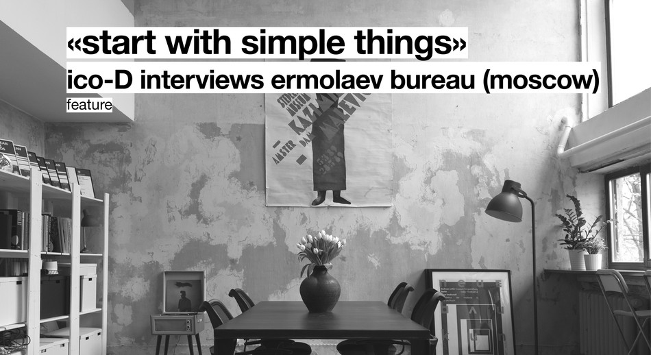
Interview | Ermolaev Bureau (Moscow)
05.11.2016 Features