Dise?o Shakespear, Signing the Subte
10.01.2014 Features
Christine Moosmann
In this article, originally published in the December issue of Novum World of Graphic Design Magazine, Diseño Shakespear’s founder Ronald Shakespear and his sons seeks to make the city of Buenos Aires easy to read by developing a new wayfinding system and visual identity for the Buenos Aires Underground.
Buenos Aires has had its Underground since 1913, and over the years the network has expanded along with the city and its population. Lacking, however, was any coherent approach to signage, let alone wayfinding; above and below ground, typographical and design anarchy reigned. At long last a new corporate design has been devised, by the Diseño Shakespear agency. It was a mammoth project that took twelve years to implement.
With its twelve million residents, the Argentine capital Buenos Aires is one of the world’s largest cities. But Diseño Shakespear’s founder, Ronald Shakespear, seeks to »make the city easy to read«. One example of what he means is the wayfinding system and visual identity that he and his sons Lorenzo und Juan
developed for the Buenos Aires Underground.
The choice of name was to confer brand character, as with the Metro in Paris and the London Tube, and so the designers simply adopted »Subte« (short for »Subterráneos«), the term already in standard informal use city-wide. Then in
successive phases between 1995 and 2007 a visual identity and a wayfinding
system were designed and introduced across the network’s six Underground
lines. A successful wayfinding system relies on a combination of painstaking
on-site research and what Ronald Shakespear refers to as »verified intuition«. Two fundamental criteria govern any system: »First, the signs must be easy
to find and their locations predictable,« he says; »and, second, the signs must
be easy to understand. «Ronald believes that designers have an obligation» to
listen to people, to decipher their codes, to discover their yearnings, and to give
them an answer.
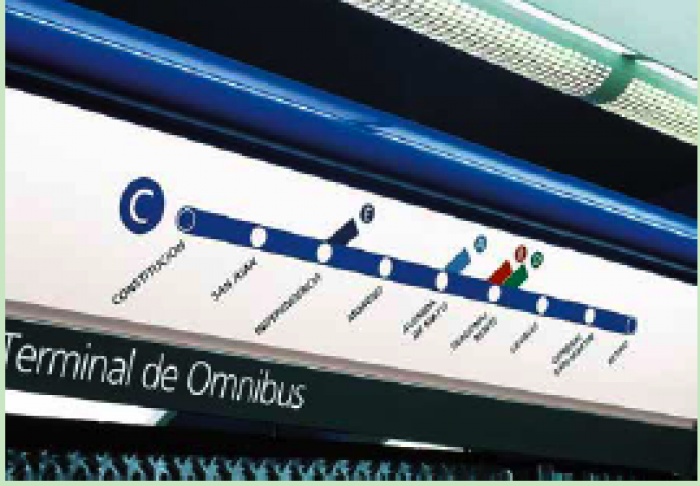
«For the Subte, the outcome is a rational und functional graphic language that communicates clearly and can be used for all 86 stations. The designers’ first step was to re-draw the old Underground map, which though topographical was very hard to follow. Like Henry C. Beck (London Tube) and Massimo Vignelli (New York subway) before them, the Shakespear team went for a simplified route diagram. Sign dimensions on the network itself are regulated by a grid system, and a colour scheme ensures that stations are unambiguously identified, the colours used corresponding to those shown on the route map.
This makes for better orientation, as do the station names, which are repeated
every 2.2 metres along the platforms. »Signs are active expressions of identity, « Shakespear declares. »They must integrate into the surrounding environment
and contribute to a sense of the place.« For their typeface, he and his fellow designers chose Frutiger, as it is easy to read and looks pleasant. Different weights organise the signs into a hierarchy. The final step was to design the station entrances, which had lasted a century without being given a common styling. Now illuminated signs, easily seen from a distance, guide travellers towards the Subte, which operates twenty- four hours a day.
The people of Buenos Aires have always been proud of their Underground, and now the Subte’s design is helping to profile the cityscape. Ungrateful as passengers will be, the most important sign for them, according to Ronald Shakespear, remains, as always, the one that says EXIT. Diseño Shakespear has
ensured that in the Subte it is at least always easy to find.
Reprinted with permission from NOVUM – World of Graphic Design, ©2013
All rights reserved. This first appeared in NOVUM – World of Graphic Design 12/13. NOVUM World of Graphic Design
About the author
Christine Moosmann is a journalist based in Munich, Germany. She started writing for various publications in 2000, amongst them novum- World of Graphic Design (est. 1924), one of the most renowned design magazines worldwide. She is now deputy editor-in-chief of novum.
relatedarticles
03.14.2022 Features
goodbye! and next steps for colleague and friend alexey lazarev
05.27.2020 Features
explorations in ethical design: meditations on equality

05.16.2017 Features
RCA launches new programme: MA Digital Direction

12.14.2016 Features
Interview | Ermolaev Bureau (Moscow)

05.11.2016 Features