Oktober(Type)Fest in Buenos Aires
04.04.2012 Features
Letter.2, the second international competition organised by ATypI, was a celebration of typographical excellence held in Buenos Aires in October 2011. It brought together a jury of experts who had the difficult task of selecting the decade's best designs within the framework of an exciting conference attended by a large number of delegates from across the region. V?ctor Garc?a shares his impressions.
10 YEARS AFTER BUKVA:RAZ!, Letter.2 reignited typographical passion among designers, educators and dilettantes alike, arousing great expectations internationally. Almost 600 works from around the world were entered in the competition, 53 of which were selected as the most representative of the 2001-2011 decade. The winning projects will be exhibited at the ATypI 2012 conference. José Scaglione directed both the event and the jury, which comprised Peter Bilak, Rubén Fontana, John Hudson, Akira Kobayashi, Lucie Lacava, Gerry Leonidas and Fiona Ross. All the jury members, plus a number of local designers, took part in the closing conference. To add a little impetus at the end of the event, we asked the director.
VG: To what extent do you think Letter.2 fulfilled its objectives?
Letter.2: They were fulfilled to a large extent. Although we were limited to working with the fonts that were sent rather than the complete typographical universe, this cross-section of the profession 10 years on from Bukva:raz! has produced interesting results and enables us to understand not only the current state of typography but also the factors impacting the way in which our profession is developing.
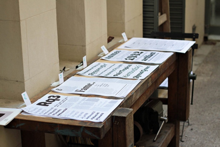
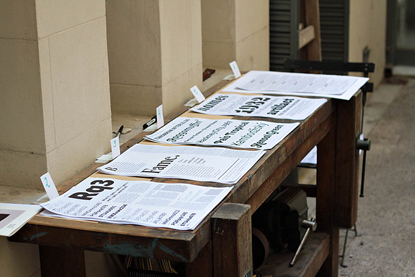
Above: Judges evaluating type samples. Courtesy ATypI.
VG: What areas need to be worked on to deepen knowledge of the role of typography in the international context?
Letter.2: The main area is the promotion of typographical practices which respect the cultural history of each region and the collective visual memory of the different peoples. There is also an extremely important role in rescuing forms of lettering and styles around the world which do not use the Latin alphabet, and in regions with developing orthographies.
VG: Have you observed any typographical constants or paradigms that transcend temporality in the general corpus of the production that has been analysed?
Letter.2: From my point of view, the most important constant is the concept of typographical quality, which is difficult to teach since it comprises a multitude of different factors. However much the technology and fashions change, the notion of what constitutes a well-designed typeface remains the same. It is also something that is above personal tastes. As a result, juries drawn from very different cultural frameworks had no difficulty reaching agreement when selecting the winners.
Above: Judges evaluating type samples. Courtesy ATypI.
The selection made by Letter.2 is an expression of the zeitgeist; to interpret it as a trend or prophecy would be an illusion with no purpose other than to ward off anxiety about the future. Typography, like life, will pursue its own development, far from the realms of speculation.
View the .
View all selected entries.
First published in 02/12, Munich (Germany).
About the author
V?ctor Garc?a (Argentina) is a graphic and type designer based in Buenos Aires. He loves imagining and exploring the creative capabilities of dingbats. He is an occasional contributor to design publications and has been a correspondent for the Munich-based magazine novum since 2002. His works have been published in Argentina, Japan, Germany, Great Britain, Spain, and the United States. V?ctor has previously contributed an article 'Typographic categories: Yes, there is life beyond letters, but... what does it all mean?' originally featured in Typo Magazine N? 45, Autumn 2011, Prague (Czech Republic). His cover for Design Scene No 52, ',' was featured in the Galeria (2008).
Copyright Victor Garcia, Buenos Aires, Argentina. All rights reserved. victorgarcia.com.ar
No part of this article may be distributed or published without prior written permission of the copyright owner.
relatedarticles
goodbye! and next steps for colleague and friend alexey lazarev
explorations in ethical design: meditations on equality
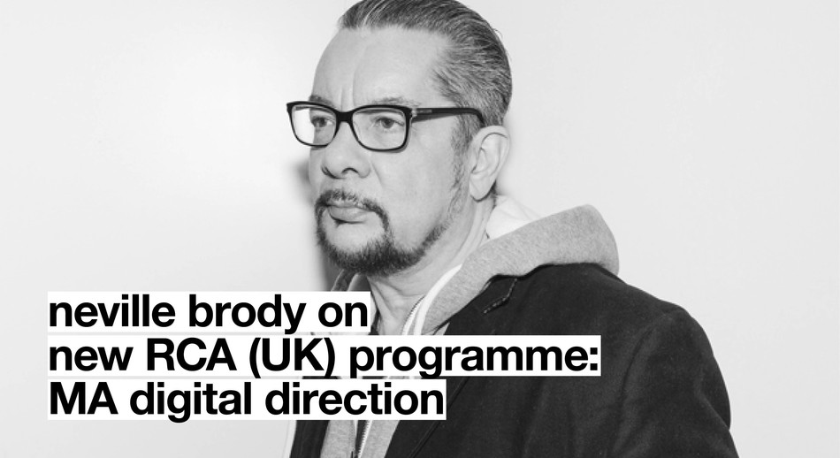
RCA launches new programme: MA Digital Direction
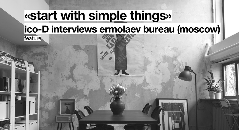
Interview | Ermolaev Bureau (Moscow)