ON THE MARK

15.07.2009 Features
Hans Kleefeld
With thousands of new visual identities flooding the market all the time, is it possible to create anything that hasn't been done before? Yes, you can cut through the clutter. But start by understanding the history and rules of effective design. In this article, originally published in , Hans Kleefeld looks at the trends and shifts in visual identities over the past 50 years, and beyond.
A recent survey of books recording contemporary visual identities induced me (I'm apparently a masochist) to do a quick image count. Nine books featured approximately 7,000 exhibits! That's only the tip of the iceberg, a small sampling of what's being churned out by drawing boards and laptops from around the world.
After only half an hour vision blurs, as logos, wordmarks, monograms, pictorial or abstract symbols blend into a confusing melange of forms and colours. It looks like everything possible has already been done - repeatedly. Are we nearing the end of corporate identity history?
Probably not. Corporations will need to continue to create favourable impressions of themselves with their publics. This, of course, goes beyond visual imagery. Strictly speaking, a corporate identity is not "designed" at all, but is a perception shaped in people's minds by much more than graphics: the quality and costs of a corporation's products or services, employee and executive conduct, financial performance, community and environmental regards, etc. However, corporate insignia, and all visual communications around them, can go a long way to encourage positive responses.
When I started my professional life, approximately 50 years ago, as a compositor apprentice in Germany, neither corporations nor corporate identities as we now know them existed. There were small businesses and big businesses, and most displayed awkward graphics on their signs, products, forms and various promotional materials. Owners' names were usually spelled out in overly ornate letters, and often supported by obscure visuals, such as the owners' favourite beasts or mythical heroes.
A few large companies had distinct house styles, typically shaped by a competent solo commercial artist, whose personal visual vocabulary came to identify that particular enterprise. Central to a house style was indeed often a marke (trademark today), which became the overall graphic persona of a business that became identified in the public's mind. Which provides the first clue as to what an effective visual identity needs to accomplish.
To create a unique logo, wordmark or symbol is one thing. To present it effectively, consistently and extensively over time is quite another. Many corporations stumble, due to a lack of vision, commitment, or because of budget cuts or management wrangles. An early example of an excellent visual identity is the Olivetti corporation (fig. 1) in Italy (circa 1925). Its name appeared in custom-styled lower-case sans serif letters. By today's standards it was a rather modest wordmark, but it was vigorously promoted wherever Olivetti connected with its customers. Supported by the consistently high quality of all of Olivetti's visual material, created by Europe's leading graphic designers, photographers and illustrators, it gained international recognition and respect.
Above: Figures 1 and 2
Of course, new corporations rise all the time. They are all anxious to make their mark, no matter how many icons already clutter the visual landscape. The ground rules for creating a visual identity are relatively simple and unchanged. Only five major options are commonly considered: a logotype, a wordmark, or a letter, pictorial or abstract symbol.
A logotype is simply a given company's or organisation's name ('logo' being Greek for 'word'), set in an existing typographic font. Plain type can be entirely sufficient if the word and entity behind it is unique. A good example is SickKids (fig. 2). The Hospital for Sick Children, in Toronto, dropped all previous graphics, officially adopted the name by which most people knew it and spelled it out in upper-and-lowercase Franklin Gothic, in two shades of blue. The logo is utterly memorable in its simplicty.
Above: Figures 3 and 4
A wordmark, by comparison, involves custom-styling of a word. It can be either ultra-simple but ingenious, as the one for the Eaton corporation (fig. 3), or complex, and sometimes over-designed, like the horrific wordmark created for Hughes Airwest (fig. 4), mercifully, long grounded.
Above: Figures 5, 6 and 7
The alternative to logotypes and wordmarks are graphic symbols (also called marks, emblems or icons), either letter-derived, such as Canada's CN (fig. 5); a pictorial, like this one for a 'girl' copywriter (fig. 6); or abstract, such as the workmark for a publishing house (fig. 7). As well, there are many symbol-hybrids: part letter, part pictorial and part abstract, in various combinations.
Does anything work best? Of course, that depends on particulars. A company can have an appealing name or an odd one. It can be a long word or short. And letter-patterns will vary dramatically between capitals and lowercase. Some letter combinations make good monograms or acronyms and others don't. The same holds for pictorial symbols. The World Wildlife Fund's panda (fig. 8) is likely to connect positively with viewers, while Bell Canada's (fig. 9) dizzy dialer (recently retired) never made many friends. Finally, abstract symbols, while they may be a designer's delight to shape, always risk being misunderstood or not understood at all.
Above: Figures 8 and 9
To succeed in a complex and competitive marketplace, an identity performs better when it is strong, simple and stable, rather than weak, intricate and ambiguous. The total output of visual messages by corporations typically runs into thousands, sometimes many thousands, and can vary significantly according to subject matter and audiences. Thus a stable identity is established and maintained best through a core graphic - be it a logo, wordmark or symbol - that is uniquely structured, memorable and makes sense to a broad audience. It must be bold enough to hold its own in combination with reams of typography, illustrations and other graphic elements, both in print and on screens, as well as deliver its message in very small sizes.
In this respect, many graphic designers have veered off into questionable directions. Their creations are illustrations, not marks. They are identities alright, and often quite charming ones - elegant typographic or calligraphic designs, whimsical pictorial or semi-abstract images. They represent what they stand for very well, but they are too detailed, unstructured and flimsy to succeed in functioning as the 'visual anchors' that hold together all corporate communications.
Above: Figure 10
One telling example of this misdirection was adopted, in 2006, by people who should have known better: the Province of Ontario's "three citizens in a trillium-shaped hot tub" symbol (fig. 10). The outcry it sparked goes to show that the public can be quite astute in recognising a bummer, especially if it costs a few hundred thousand dollars, funded by taxpayers! Some critics ascribe this kind of problem to more visual identity work now being done by advertising agencies. Their creative teams operate with a different mindset; they are usually focused on seasonal projects, as part of particular campaigns, as opposed to creating lasting identities. They are focused on the short term, not long. Advertising agencies may also be the ones responsible for a confusing "corporate identity" with "branding." They are not the same thing. Corporations typically have many different branded products or services in the marketplace. The company is not the brand. It has brands.
So, what really works? A number of years ago, London's The Financial Times commissioned an international panel of judges to identify, once and for all, "the greatest logos of all time." They selected 50 (though some were not really logos at all), showing what had lodged deeply in the memory of many. Name the companies for at least a dozen of these - Shell, Esso, Greyhound, Coca-Cola, Ford, 7Up, Kellog's, Evian, FedEx, IBM, Apple and CN - and the logo or graphic will automatically spring to mind. (If they don't, you probably live in a cave.)
But the most interesting part of this collection was the eclectic mix of identities, ranging from superbly shaped graphics to oddballs. From among the odd-balls emerges "the greatest logo of all time": the Michelin Man (fig. 11)! Friendly, sure, but a graphic triumph? It's hard to imagine him being designed today.
Above: Figures 11 and 12
Still, the Michelin Man spawned a noteworthy variant of visual identity, the "liquid identity." At odds with orthodox thinking, which insists on rigid maintenance of a core graphic, the liquid identity has an essential persona that remains the same, but appears in many different configurations. The Michelin Man is certainly recognised, however he shows up. In this vein, but from a typographic standpoint, the Netherland's Architectural Institute adopted a multi-font acronym (NAi) plotted in many different configurations by Canada's Bruce Mau (fig. 12).
Still, we return to our central question: Has our visual vocabulary of strong and simple marks been exhausted? I don't think so. Teaching a course in corporate identity design at the Sheridan Institute of Technology and Advanced Learning, in Oakville, Ont., I am always encouraged when I see how inventive some newcomers can be. Mind you, it takes effort to impress young minds with a need to step back from their beloved laptops and engage their brains in focused and critical thinking. Too many expect furious keyboarding and clicking to conjure up valid identity concepts mechanically.
Above: Figures 13 and 14
As society as a whole continues to evolve new ideas and ventures, the material manifestations of that evolution constantly emerge in the world around us, in new objects, processes and effects. It is up to the current and next generation of young designers to capture the essential qualities of all this new stuff in precise graphic forms. In doing so, they will carry on a historic tradition of visualisation of humans' many activities that began with-what? Egyptian hieroglyphs (fig. 13)? Medieval craftsman marks? Cattlebrands (fig. 14)? GE's 1890 Monogram? Whatever. As the global community and multicultural communications continue to expand, there's plenty of work still to be done.
Above: Figures 15 and 16
So how about this one: a Sheridan student's concept (Matthew Yu, class of 2006) of a new mark for the Toronto Transit Commission. The TTC has stubbornly hung on to a graphic relic (fig. 15) that should have been derailed ages ago. Yu showed that there is indeed a better way (fig. 16).
This article originally appeared in Applied Arts Magazine, Vol. 24, No. 4, August 2009, and has been republished with permission.
|
About the author |

relatedarticles

goodbye! and next steps for colleague and friend alexey lazarev
explorations in ethical design: meditations on equality
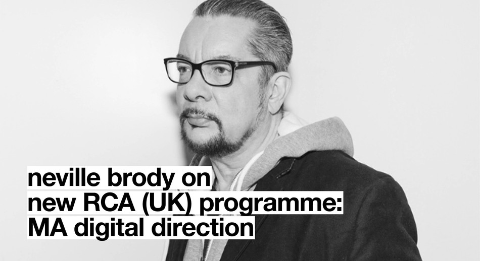
RCA launches new programme: MA Digital Direction
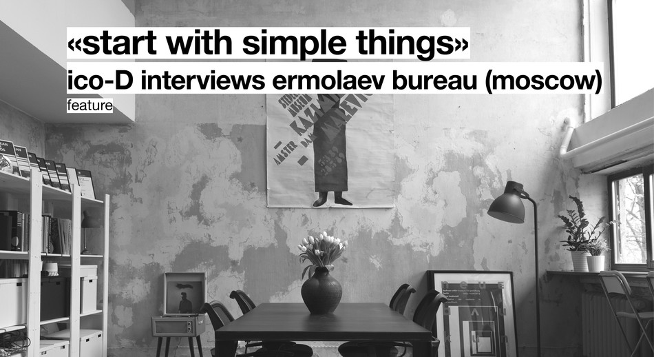
Interview | Ermolaev Bureau (Moscow)