VIRTUAL TYPOGRAPHY - A NEW APPROACH TO MOTION GRAPHICS?
22.04.2009 Features
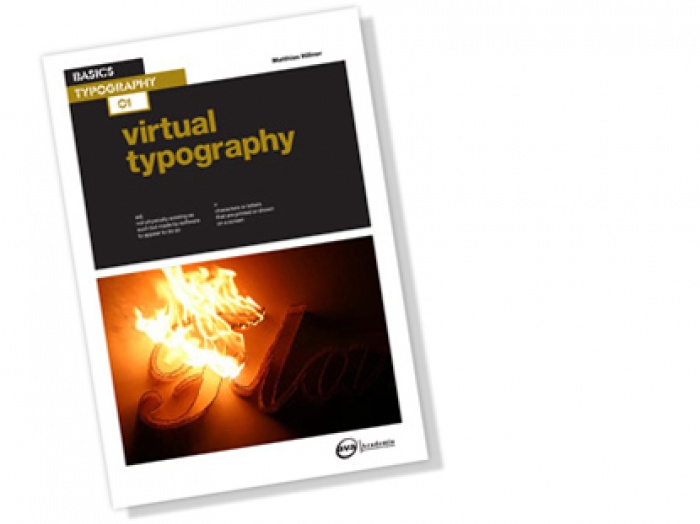
Matthias Hillner, Studio for Virtual Typography, 2009
In an image-saturated world, type design can have a hard time standing out. In this Feature, Matthias Hillner looks at the new ways of using transitional typography and motion graphics to transmit information. With various examples of experimental work, advertisement strategies and signage, Matthias Hillner shows how innovative design has impacted us in the past, and where virtual typography might be headed in the future.
In line with a previously published paper [1] virtual typography is understood here as virtually, i.e. nearly, typographical information. This article sums up the gist of a book entitled 'Virtual Typography' that is soon to be published worldwide by AVA.
It has been more than fifteen years since the US-American philosopher, Michael Heim, stated that "we drive a technology that drives our life faster and faster." [2] Little has changed since and the acceleration rate shows no sign of fatigue. Broadband connections, Wireless Application Protocols and online TV ensure that every little piece of information remains accessible anywhere around the globe at any given time. If Heim is correct in claiming that "the more information accessed, the less significance is possible" [3], then there is a clear need to decelerate and to decompress communication processes.
So how far does the process of communication reach? Where does it start and where does it end? And why exactly should we slow it down? The degree to which a message is memorised depends more on the amount of time an information recipient spends on contemplating it, than on the ease with which it is acquired. Certain scientific studies even suggest that the harder it is to decipher a text message, the more likely it is to be remembered. If we make information retention one of our key targets, we realise that the success of our design work depends not so much on the efficiency with which information is delivered, but on the effect it has, i.e. the degree to which the work captivates people's minds. In other words the retention of text information depends on the experience that accompanies the reading process.
One cannot deny that typographic information struggles increasingly to compete with image-based information in our information-rich environment. The 'commonly held belief that there is a shift toward the image from the written word' [4] led Professor David Crow from Manchester Metropolitan University to write a whole book about the matter. On the other hand there lies an interesting opportunity: If we convert typographic elements into time-based imagery in order to let text messages evolve gradually, then we can combine the aesthetic appeal of image information with the precision of typographic information. If we succeed in providing an aesthetically stimulating experience through the careful definition of this transition process we can captivate people's attention over an extended period of time.
The project 'Still Standing' by Jason Lewis and Bruno Nadeau from OBX Labs at Concordia University in Montreal, Canada provides a striking example of how people can be enticed to pause for a moment in order to focus on text information. Here individual letters hover seemingly randomly across the bottom of a large projection screen. If a viewer moves in front of the screen, the motion of letters is disturbed. If the viewer remains motionless for a while the letters take on the shape of the person to reflect the viewer's posture and the text turns readable. As soon as the viewer begins to move again the figurative text composition falls apart. The creators' aim was to induce a state of 'inter-inactivity' that defies the 'constant barrage of frenetically edited image, video and audio streams' which have become part of our 'high-speed culture'. [5]
We may argue from a design point of view that 'Still Standing' is an art installation that works only within a gallery setting. However, in 2005 the British TV station Channel 4 provided proof for the fact that the deceleration of communication processes can be very beneficial for commercial purposes. The award-winning TV branding campaign, which was created in house under the creative direction of Brett Foraker, uses up to thirty seconds of valuable airtime in order to draw viewers into a visual guessing game. The Channel 4 logo evolves here over time from what appears initially like a more or less common filmsetting. The logo does not rest on screen. As soon as it appears it falls apart again, leaving a little bit of a visual challenge left so that viewers will want to review the sequence a second and a third time. Other channels tried to adopt the principle of letting type evolve gradually from an image and failed. At the same time Channel 4 succeeded in applying the principle in a variety of ways to its sister channels E4 and More4. What is it that made some virtually typographical TV campaigns succeed and others fail?
What we know for a fact is that the dynamic image-text relationship that is inherent to virtual typography is neither bound to digital technologies nor to time-based media. Alan Fletcher, co-founder of Pentagram Design, designed a sculptural-typographical window display for Time Life in 1984. The words 'time' and 'life' were constructed from metal rods that were hanging disjointed in the shop window. The company name could be read only when seen from one particular angle in the road. So people were encouraged to move back and forth to read the words. As rudimentary as this display may appear today, it deployed the visually intriguing effect of virtual typography very effectively. The display stood out through the delay in the disclosure of information. So virtual typography is not a new phenomenon and, whether or not it succeeds in having a puzzling effect on viewers, depends on how it is applied. I must admit that it may be much harder to induce patience within information recipients than it was in the 1980s. But if we succeed in doing so, we can still make sure that our message will be remembered.
There is an increasing number of opportunities to introduce virtual typography to our communication strategy. Since 2005 we have seen posters being replaced by screens in the London underground system. Initially the information remained static here. It seems strange to me that it took the designers nearly two years to learn how the individual displays needed to be synchronised to allow for people passing via the escalator to perceive animated information here. Now we see the first billboard posters being replaced through digital displays. But the efforts in producing suitable transitional information remain humble, as humble as the efforts of academia to introduce motion graphics to their curricula. Whilst technologists continue to experiment with screen displays as thin as paper, we designers struggle to make sense of the opportunities that are opening up. The last decade seems a lost decade. Little has happened in the world of graphic design. No groundbreaking developments in the field of design or typography have taken place. No new schools of thought have emerged. If we compare the last eight or nine years to the preceding decades, we realise how static our design culture has become. David Crowley's reference to an 'Age of Anxiety' [6] may bear some indication to why so little has happened: Change always comes at a risk. Our anxious design community is aiming for damage limitations during a period of time that has been hit by economic recessions unlike any other.
If virtual typography turns into an irritating gimmick or into a sensible means for decelerating communication processes depends on what academia and practicing designers make of it. My book hopes to motivate the critically reflective evaluation of design solutions in the area of transitional typography and motion graphics, and to encourage designers to take inspiration from the first advances in the field. The texts may provide as many questions as answers. I would like to encourage readers -design practitioners, students and lecturers alike - to pick up those issues and to take the discussion further. I shall hope that the informed discourse surrounding media communications in general and virtual typography in particular will provide us with new ideas and concepts to re-introduce the time factor to visual communication. As designers, we should aspire towards slowing communication processes down, and we need to speed up our efforts in doing so.
Sources
[1] Hillner, Matthias: Virtual(ly) Typography - Towards a notion of Poetics, Icograda,
[2] Heim, Michael: Metaphysics of Virtual Reality, Oxford University Press, Oxford, (1993)
[3] Ibid
[4] Crow, David: Left to Right, The cultural shift from words to pictures, AVA Publishing SA, Lausanne (2006)
[5] Lewis, Jason, Nadeau Bruno: Inter-inactivity, Digital Arts and Culture Conference, Copenhagen, Denmark (2005)
[6] Crowley, David: Graphic Design in an Age of Anxiety, Icograda, /feature/current/articles168.htm
About Matthias Hillner
Having graduated in visual design at the College of Design Schwäbisch-Gmünd, Germany, Matthias studied Communication Art and Design at the Royal College of Art in London. Following his MA in 2001 he worked for various institutions such as Pentagram Design and The National Gallery. In 2004 Matthias returned to the Royal College of Art for a three-year long research into media typography. At the same time he began to teach graphic design and multimedia at various academia including Ravensbourne College for Design and Communication and the London Metropolitan University. In 2006 he was appointed Course Leader for BA (Honours) Graphic Design at Amersham & Wycombe College in Buckinghamshire and Senior Lecturer for typography and multimedia at the University of Hertfordshire. Matthias received his MPhil in Communication Art and Design from the Royal College of Art in 2007. His book entitled as Virtual Typography is based on his research findings and published by AVA in 2009. Further details can be found on the AVA website and in the research section of www.virtualtypography.com
Matthias invites comments, questions and critique in response to his book.
A page on the virtual typography website is dedicated to accommodate a
discussion surrounding the subject. Please email your responses to
research@virtualtypography.com
About Studio for Virtual Typography
In 2005 Matthias received a business development award from NESTA (National Endowment for Science, Technology and the Arts) in the UK. This led to the formation of the Studio for Virtual Typography, which was based at the National Film and Television School (NFTS) in Buckinghamshire for the first two years. The Studio for Virtual Typography provides visual design services and has been commissioned by companies such as B3 Media, ARRIVA and Skillset, the Sector Skills Council (SSC) for Creative Media in the UK. In addition to its commissioned work, the Studio for Virtual Typography produces works in the field of fine art which are frequently traded at the 20/21 International Art Fair in London, at the NewcastleGateshead Art Fair and at the Affordable Art Fair in London.

relatedarticles
03.14.2022 Features
goodbye! and next steps for colleague and friend alexey lazarev
05.27.2020 Features
explorations in ethical design: meditations on equality
05.16.2017 Features
RCA launches new programme: MA Digital Direction
12.14.2016 Features
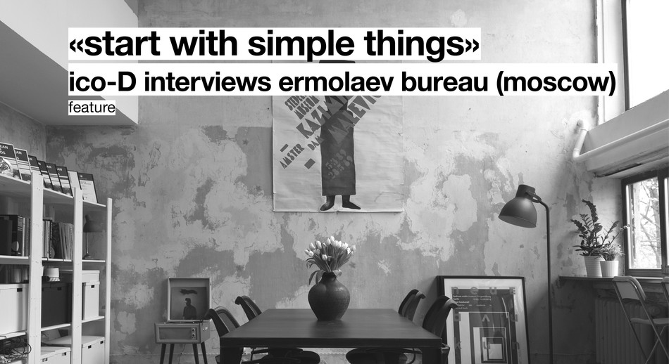
Interview | Ermolaev Bureau (Moscow)
05.11.2016 Features